Good brand identity design often looks effortless from the outside. But when you talk to someone like Wells Collins, you’re reminded how much work actually sits beneath the surface. Wells is a Denver-based award-winning brand designer known for his typographic work and custom wordmarks. Over the years, he’s carved out a space working with startups, helping them build brand identities that feel clear, flexible, and actually usable from day one.
What stands out isn’t just the style of his work – it’s how he gets there. Every project starts the same way: away from the screen. Sketching, testing, exploring, and then refining. Because for Collins, strong brand identity design isn’t about landing on a good idea quickly – it’s about earning the right one through volume, exploration, and restraint.
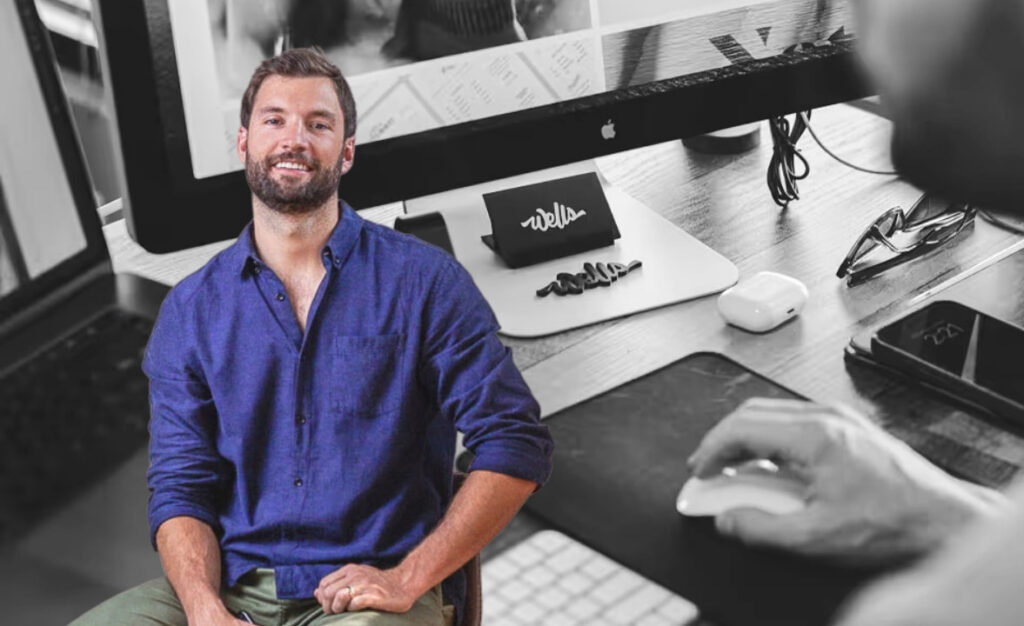
We spoke to Wells about how his thinking has evolved, how he approaches positioning, and why staying a little uncomfortable is part of the process.
What do you want your brand to be known for – and what do you actively avoid being known for?
Quality, first and foremost. Design has been a passion for a long time, never just a job. While many senior designers eventually migrate into director roles, I’ve refused to give up the tactile process. I’m still obsessed with the craft. Clients often find me because of the hand-drawn quality of the work. Every project starts with a pencil and paper, and I believe deeply that quantity leads to quality when it comes to ideation. The more ideas you throw at the wall, the more informed the final solution will be.
As for what I’m actively against: I don’t want to be a generalist who does everything for everyone, a production artist pushing out templated work, or the cheapest option in the room. If you’re shopping on price alone, I’m probably not your guy.
How has your positioning changed since you started?
I started my career as a web designer but pivoted to brand design early on because I loved designing logos, building visual systems, and working on packaging. Over the past eight-plus years working primarily with startups, I’ve learned what it actually takes to get a brand up and running. Smart, scrappy, and built to last. Very rarely does a small business need a 500-page “brand bible.” I pride myself on building modular systems that are scalable and flexible without the bloat.
These days, I typically include a homepage design as part of my brand offerings to help clients hit the ground running. So in a way, I’ve come full circle back to where I started. Just with a much sharper point of view.
What type of work best represents your brand today?
My work tends to skew typographic. I started hand-lettering as a way to step away from the screen, and it became a passion that bleeds into almost everything I do now. I try to inject hand-drawn elements wherever they make sense. Custom wordmarks have become a real staple, both creatively and as a core part of my business. If there’s one thing that feels most me, it’s a carefully crafted, hand-drawn wordmark with a distinct personality.
Have you ever niched down – or deliberately stayed broad? Why?
Deliberately broad. A few historical figures I keep coming back to are two iconic design duos: Massimo and Lella Vignelli, and Charles and Ray Eames. What always struck me about them wasn’t just the quality of their work, it was the range. Airline brands, subway signage, furniture, clothing, architecture. They moved fluidly across disciplines because they treated every project as a problem worth solving strategically.
These days the common advice is to niche down, find your lane, specialize. And while becoming an expert matters, wearing blinders is a fast track to creative stagnation. I’d rather keep taking on new challenges, working with new people, and staying slightly uncomfortable. If you’re not uncomfortable, you’re not growing.
What differentiates you that clients don’t immediately see?
Most people get a feel for the aesthetic from the portfolio, but what they don’t always see is the depth of process behind it. After a kickoff call and a thorough creative brief, I put the screen away and go analog. I’ll sketch logo and identity concepts literally hundreds of times before narrowing down to my top directions. It’s not just a warm-up. It’s how I make sure I’ve truly exhausted the concept before committing to a solution. That thoroughness is what lets me deliver quality work consistently, and it’s something clients tend to feel in the final result even if they can’t always name why.
Final Thoughts
Talking to Wells, one thing comes through clearly: good work takes time. Not in a slow-for-the-sake-of-it way, but in a considered, intentional way. The kind that gives ideas room to develop and avoids jumping to the first solution.
His approach to brand identity design is grounded in a few simple ideas: start with exploration, keep things flexible and practical for real-world use, focus on clarity over complexity, and stay close to the craft, even as you grow. It’s a perspective that feels especially relevant right now. With so many tools promising faster outputs, it’s easy to forget that the strength of a brand often comes from the thinking behind it.
And sometimes, that thinking starts with something as simple as pencil and paper.
Explore More Brand Identity Design Professionals
If you’re an agency, designer, or startup looking to boost your visibility, you can join Norobots and become part of our curated network of trusted businesses. If you’re a brand or client searching for the right partner, our platform helps you discover agencies, designers, and startups you can rely on. Browse the listings and find the right fit for your next project!